Depending on how old you are you might remember the good ole´ days of buying CDs in actual (physical) record stores. If you are like me, you might have occasionally bought albums “blindly”, merely by looking at the cover artwork.
Times have changed and most people consume music via streaming services or by downloading songs in digital stores these days. However, the power of good artwork is still apparent, especially when browsing through the roundabout 80.000 new songs that are being uploaded to platforms like Spotify EVERY SINGLE DAY! Let that number sink in! Needless to say that every aspect of your “product”, including the graphic design has to be spot on, so not to miss out on opportunities to catch somebody´s interest and market your music to your target audience. The market is fast-paced and it is a lot harder than it once was to gain “loyal”, long-term fans. Therefor you should approach every release with the mindset of someone entering the market for the first time. Giving it your full attention and not relying on an existing fanbase too much. There is no room for getting lazy or careless, unless you do not care about your music in the first place.
With that said, I want to focus on the bright side. In our digital age, there are plenty of great tools to help you create compelling artwork with little or no budget – all by yourself. It´s all about getting creative. How does that sound?
Some of the most common formats when talking about album covers are either a portrait of the artist or band, or a logo based approach with a special typo, or a still-life image – to set a certain mood. You can obviously also invest into more complex designs, such as original comic art or fine art photography, if you decide to hire someone who´s an expert in their field. It all depends on your budget.
How different formats can bring various results
Let us quickly look at how these different formats I just mentioned can help you communicate an actual message to your audience.
The portrait approach:
Displaying a portrait or some sort of photograph of the artist(s) is a great tool when trying to connect with potential fans. “People buy from people” is how the saying goes. A picture of the artist(s) can convey a mood, e.g. an aggressive look, a sweet look, a laissez-faire attitude and the likes. When shooting a cover, invest a lot of time into planning your outfit and color choices.
Great examples of cover art featuring the artist are:
Adele´s album covers, that all focus on her face. Keeping things simple, clean and timeless, like her music. Adele´s soulful voice needs no special effects, and same goes for her album artwork. It´s a no brainer really if you have a voice like her!
Miranda Lambert is another great example of an artist that mostly markets her own face on album and single artwork. In her case, she always plays with scenery, that instantly makes you think of a fun and modern country atmosphere. She´s all about glitter and colors in her overall brand appearance and adds some glam to real-life music.
Justin Bieber´s artwork over the years shows an evolution form a teenage easy-going, non-chalant singer to a more edgy pop artist.
In some of Beyonce´s covers over the years, you can see her in poses, that most always convey a sense of movement and dynamic. She might use her arms to create momentum. This fits 100% with her music. That´s what cohesive branding looks like.
The graphic design approach:
Whether you just place a logo boldly in front of a uni-colored background (like Beyoncé did with her platinum edition album) or playing with fonts and color patterns like often seen on “30 Seconds to Mars” covers, the message is usually very bold and confident (needing no photograph). It speaks “Buy it or leave it” and can evoke curiosity and trigger dopaminergic circuits. This approach is more recommended for artists that have established a fanbase though as well as for artists that do not even plan on building a huge fanbase, but want to focus on getting music placed in sync, in which case, keeping it simple can be beneficial, so that music supervisors do not get hooked (or biased) on a certain visual idea too soon.
Chris Stapelton boldly released an album with an all-white cover only displaying his name and the title in a typewriter style. This is a great way to visualize his storytelling style while also evoking curiosity. He also had an interesting cover on his “From A Room” covers, which featured his face in an iconic Americana inspired graphic. Almost makes you want to grab a hot drink at your local coffee shop and head to a cozy old-school record store to meet with friends and listen to the album.
The still life approach:
This artform is often seen in folk music or music that´s centered around dreamy, nostalgic topics or reflective themes.
Still life such as landscapes, sunsets or even urban art like graffiti walls are a great way of commucating a certain sense of “bigger picture” thinking and self-less ness. This is not a very ego-based approach and invites the listener to be taken by the hand while going on a journey with the artist. It gives “room” for discoveries and mind-opening messages.
A great example that comes to mind is Taylor Swift´s “Folklore” cover.
Let´s get to it!
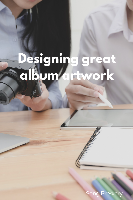
Now that we know what options we have, you might wonder how to produce artwork yourself and ideally without spending a fortune.
One great way to design a basic layout if you have no background in graphic design is to use a free app like Canva.com. This app allows you to choose from plenty of fonts, backgrounds, stock photos and graphics, as well as plenty of colors and filters to spice things up. You can upload your own photos and resize things, zoom in and out and place fonts and other picture layers over it.
If you are familiar with basic graphic design, then tools like Adobe Photoshop or Illustrator or Affinity Designer are your friend and give you all options.
When designing your cover, you will want to pay attention to not over-crowd things while keeping an eye on your core message.
Using more than two fonts is generally considered unprofessional and will look too messy. But then again, rules are made for breaking them!
I recommend researching basic color theory, if you have never worked on visual designs before. Watching the values of your colors will help you create a professional looking composition, that doesn´t look “off”.
Now, go and have fun getting creative!
Make sure to sign up to our newsletter (below), so to receive updates on new blogposts as well as special deals and event invitations.
Also, follow us on Instagram: https://www.instagram.com/songbrewery/